Saturday 20 November 2010

fonts for music press magazine

i used dafont.com for my fonts and out of all the ones i looked at i prefered this one. it also keeps in tone with the key conventions of an indie rock magazine there is a sense of rebelion with the use of paint splatters on each individual letter.
however, i would only use this font for articles and/or sub headings. i would used a bolder font for the masthead itself unless i would be able to add effects on photoshop to make it one whole colour without the paint splatters.

flat plan for key demographic


original photos for prelim task


Typography and colours

to find different fonts and to make sure that i wasn't using the same fonts as everyone else i went out on
dafont.com where there are loads of different fonts to choose from.
i chose this font because i liked how you can create definition between the letters which was the reason i
chose to use 'ABSolute' as the name of my arts magazine.
looking back at the planning of my magazine i would of used different colours even thought there was predominantly girls taking art at the college.

Photoshop

i really liked using photoshop because you can either drastically or subtly change a picture and it makes all the difference

This is my original photograph for the cover of my arts magazine.


this is the edited version

i used a tool called liquify to allow me to warp the background and i changes and brightness and contrast by using to toolbar

Thursday 18 November 2010

Analyising Prelim Task

For our prelim task we were asked to design a front cover and contents page for an arts magazine for our school. We took original pictures and used photoshop for editing the images.

Research into the Music Press

In recent years there has been a growth into the amount of music magazines available for a variety of genres. There's bound to be a music magazine out there for everyone that concentrates on the genre of your choice. the old school magazines such as NME and KERRANG! have a combined age of 77 which proves that even though reviews, new bands, interviews etc can be found quicker and for free online there is still a market for magazine readers.


You can see the drastic difference between the two front pages of NME. The left is a copy from the 1980s and the right from 2008. This change could have been because their key demographic became younger and they needed a more clean cut look. Other contributing factors would have been technology advancing and allowing them to add different effects and logos to the covers.
NMEs total circulation from July-December was 38,486 copies and KERRANG! had a total circulation of 43,000 insinating there is a larger rock/metal following than there is of indie rock.

so im not just concentrating on NME and KERRANG i swapped KERRANG with Uncut magazine in doing the following research


readership (%)


ways of consuming music (%)


feelings about music (%)

Masthead Research

Before we start the prelim task i picked for magazine mastheads and analysed them this gave insight into the type of genre i would like my music magazine to be and what conventions i would need to include to achieve this goal.


Comparative Analysis and Evaluation of Music Press Front Page


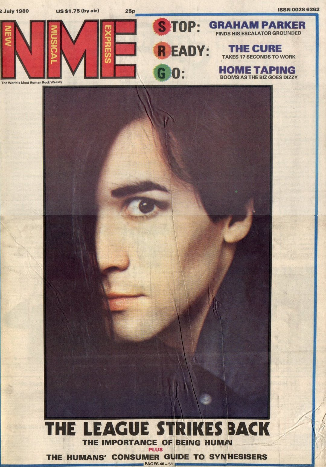
The generic music convention code employed by NME suggest the target audience are young males from 16-24. You are made aware of the older ages as the bands that are mentioned are all bands that have been around for a long time and 24 year olds would have been listening to them when they were teenagers. This magazine is predominantly male as all bands mentioned and shown are male icons, however this will attract a small amount of girls/women who admire them for their looks. The fonts used are also a reflection of the stereotypical male; bold and strong and the front cover as a whole doesn’t looks as pristine as other music magazines such as Q. This gives a younger fresher feel.
KERRANG!’s key conventions suggest a similar target audience, young males from the ages of 16-30. However, It is evident from the font cover that although they derive from the same music genre KERRANG is heavy metal/rock. Its masthead is a reflection of this. It’s been given a shattered effect which suggests rebellion, something which the heavy metal/rock scene seems to promote. The word KERRANG! Also sounds like the sound a guitar makes when it has been distorted, an instrument which is very important within this genre.
The mode of address suggests that the audience is not of a very high education level. All features are written in short sharp sentences. With little to no expansion on what the feature also contains. For example on the NME front cover there is just a list of bands with little explanation of what will be contained within the article 


Comparatively it is clear that both magazines have different intentions, purpose and target audience. NME may appear to be for a younger more mainstream audience however, both magazines are targeting different audiences from different genres of music

Here is an example of the two bands featured on the front pages of these music magazines